
Continued from early waypoint tag concepts
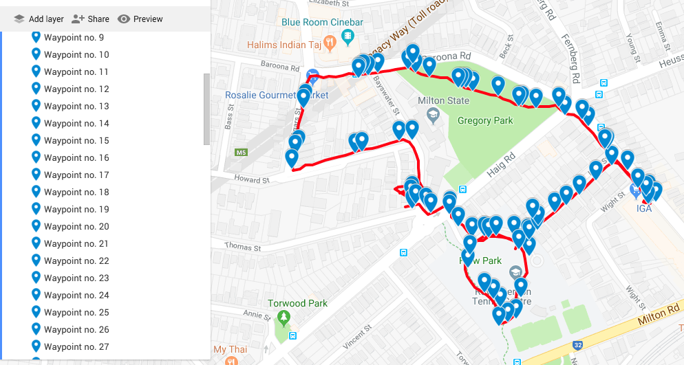
The first play test dog was achieved with two researchers walking in tandem with the dog. This meant that one research was able to drop in the tags while the other walked with the dog. Adding waypoint tags to dogwalk is actually fairly cumbersome. The steps are: Open the app (it runs in the background); hit the map to open a pin drop dialogue box; type in the text.
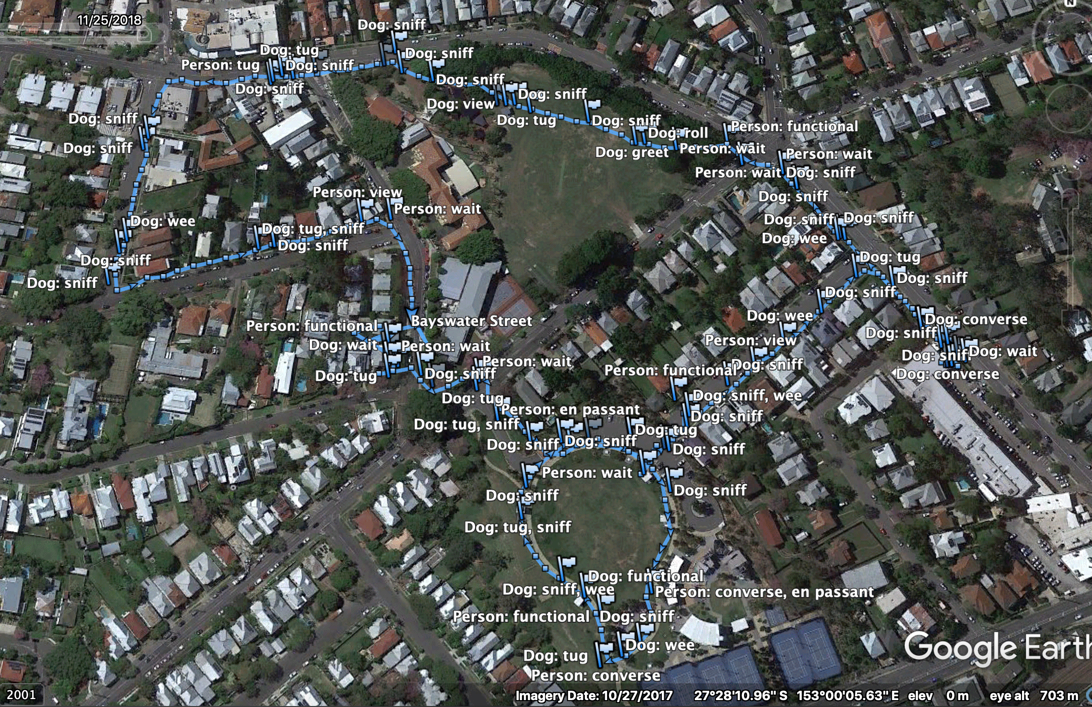
The first walk did result in a rich set of data. The GPX file with its tag codes was run through excel to convert the codes to text so they could be read more easily. It was then viewed via Google Earth.
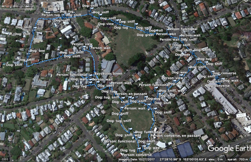
This is perhaps too many distinct tags for a single walker without a co-researcher walking along beside. Some of the proposed tags were not as useful as one might suppose (at least in the case of the specific companion animal). Sniff (S) for example was less of an event but more of an approach to the terrain on the part of the dog. This could be because the breed is a slightly famous ‘garbage guts’ and will seek potential food where ever it can and probably because the data collection itself slowed down the pace of the walk giving the companion animal time to sniff around a lot more. Tug (T) was also too vague. The Dog Wait (DW) tag didn’t seem viable as it was again, too vague and didn’t fit in with any actual recorded behaviour.
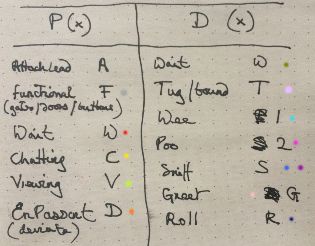
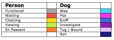
Refined waypoint tag set – colour selection based on distinct colour set based on Kenneth Kell’s 22 colours of maximum contrast.
Typical map backgrounds create issues for data visualisation clarity and limit potential colour use. The waypoint tag list is still a work in progress but we wanted to get an idea of what a data visualisation might reveal.
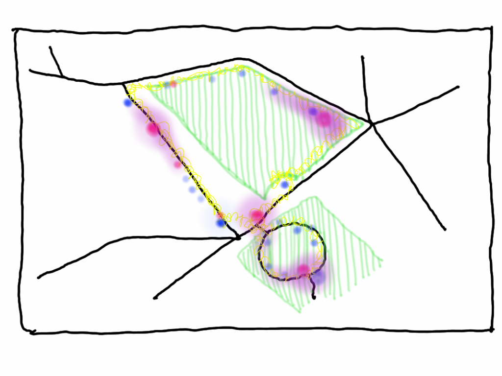
The first data visualisation animated mock-up. Waypoints scaled according to a rough estimate of time spent according to the GPX file.
To trace route or not to trace route?
A key concept in early discussions about potential design work was the importance of fore-fronting the experience over the autocracy of the line of the route. A potential visualisation concept was to show different activities as nodes and to indicate time spent engaging in the activity.
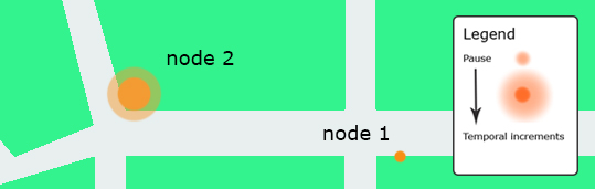
The concept here was that this would give us hotspots over a selection of walks which could be used as indicators of place-making.
While the typical line of the GPS app is too overt and flattens the record of experience, no route line disappears the nature of the journey. Both nodes and routes need to be visualised together.
Inspirations
Craig Taylor’s work is the inspiration for subsequent data visualisation work.