Following on from design insights based on the initial GPS tracking and waypoint tag work, current data visualisation aims to reveal activity in place in order to design different ways to display the data over time.
Waypoint tags – testing phase
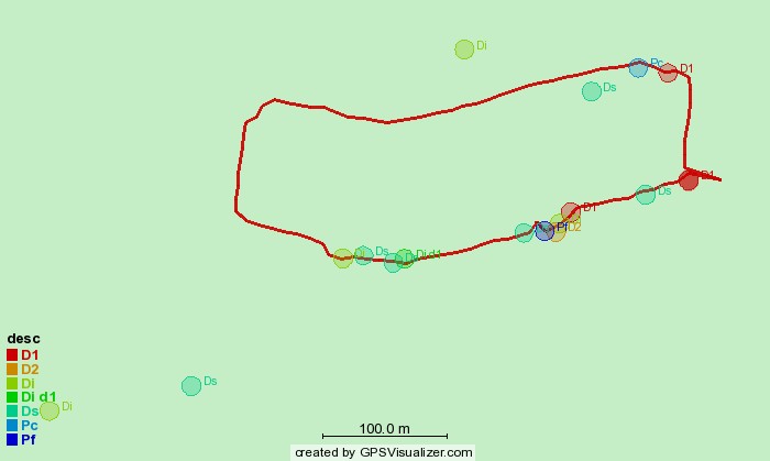
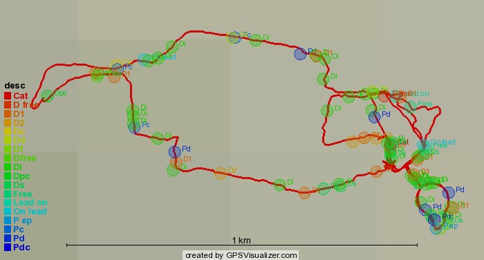
The first test phase of data collection ended up using a limited set of tags for the waypoints – mainly because these emerged as the pertinent tags and in part due to the multi-step process of adding them by hand
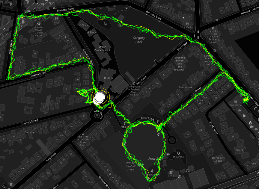
Tracks generated with dogwalk and GPS Route Logger Dongle
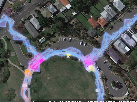
Using RunParticles – neat little GPS track animation program
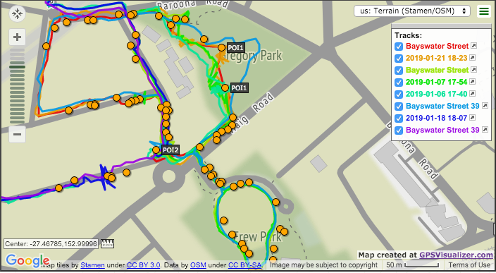
Using GPSVisualizer – routes and waypoints display option
Using GPSVisualizer – data points colorizer option